Rule of Thirds
Rule of Thirds is a technique of composition in which a medium is divided into thirds, creating aesthetic positions for the primary elements of a design. In an animation sense it is most commonly the positioning of the images inside the main image, for example if it’s a game poster and the designer used the rule of thirds the character or object would be on one of the power points, along the lines of the thirds.


Golden Ratio
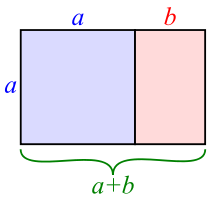
There’s a common mathematical ratio found in nature that can be used to create pleasing, natural looking compositions in your design work. It’s believed that the Golden Ratio has been in use for at least 4,000 years in human art and design. However, it may be even longer than that as some people argue that the Ancient Egyptians used the principle to build the pyramids. The Golden Ratio number is 1.618 and is the number that designers use to plan out their compositions to make them as aesthetically pleasing as possible.


Framing
Framing is a technique that influences decision making and judgment by manipulating the way information is presented. In an animation sense it is the layout in which something is presented. For example when there is a very close up image around the edge of the image so that you can really get a sense of depth into the image to see how far away and how close some objects really are and draws your eye right around the image.
Perspective
The term perspective refers to the representation of objects in three-dimensional space (i.e. for representing the visible world) on the two-dimensional surface of a picture. Basic, or linear perspective rests on the fact that although parallel lines never meet, they appear to do so as they get further away from the viewer towards the horizon, where they disappear. The sides of a road, railway lines, are some obvious examples.


You may not think all of these are linked together and relate however they actually are. This is because they are all principles of design & composition which means they are rules you have to obey if you want your designs to be the most eye catching and visually pleasing to the audience.
Hey Sam good post on the principles of composition, the examples given make it very clear what you are communicating. The blog in looking smart with the colour scheme and layout. It will be good to see the other posts appear, especially the “Reflective blog post 1” Video.
LikeLike